Friday, September 28, 2012

talk response, hyun.


Alec Soth

Before the talk, I knew and recognized his name but not his work. I just knew that he was a famous photographer. So I decided to wait until the talk starts and listen. Maybe that’s why I was disappointed of the talk because I thought he would have prepared more than he did actually just because all I know was his name and the fact that he was famous. And I wanted someone inspiring. The talk started without any particular purpose or aim I felt. I think it was really just a talk. The start was almost like “okay, I’m here, what should we talk about, I don’t know, but let’s do this because I’m here, what do you wanna know”. I just thought, maybe he’s a cool fun photographer that I don’t really know of.
In general, He talked about the projects he had done/participated in the past called “sleeping by the Mississippi”, and some zines he worked on with writers, and the project he is working on now which is called “Little Brown Mushroom”. Also, he works with other people a lot, for example, writers, they would just plan a travel and go and Alec would take pictures and the writer would write. For the Mississippi project, He said, He was “running away from society but didn’t actually want to be alone, needed company, hungry for interaction and collaboration”. I think that was especially something to remember because I thought that was “real” what he said in terms of instinct, human, and emotion. His talk kind of made me want to go outside. Going outside to interact with people who are in this area or other area, Just working with other people sound somewhat interesting. To me, when it comes to doing some work, I always kind of knew what I want so I plan and do by myself because I just feel comfortable that way. However, I think it might be fascinating to work with other people in same situation because I don’t know what they would do because they are not me.
Also, I thought I want to start zines too. I think it has a lot of potential because self publishing can give me some idea to figure out what I’m capable of and what I want to do especially because I am interested in photo, typography, etching (printmaking).. the talk kind of made me think and consider what I really want to do later.
I think I was disappointed because I could feel he didn’t really prepare for the talk and how he answered to audiences but it made me think many things of what he said and his images are beautiful. He could have explained or talked better, though. After the talk, I realized how important it is to convey one’s idea or thoughts well with right and considerate choice of words.

Sterlin Ruby

I thought the talk was quite interesting, however I wish they spoke more about his work rather than his life story. Obviously his life experience is relevant to his work however I thought it was discussed too much, and because I am not very familiar with his work, I wish it could have been discussed more.
I thought it was interesting when he talked about the process and his transformation as an artist from the first college he went to, which was mainly focused on technical skills, and then to SAIC and how his view of art changed. I loved when he talked about Bruce Nauman because I really like him as well, and that whole part when he talked about working at the video database and discovering artists, it seemed like he really learned a lot from it. I wish he talked more about Mike Kelley and what it was like working with him, but I understand why he didn’t.
From the few pieces we have seen of his, I especially liked the bus piece and the cages piece, and I also noticed their shapes were echoing one another. I liked the experiences and transformations the bus has been through, it looked almost haunted. 
What I found most interesting in the discussion was when he talked about that theory of the aura affecting the space (or something like that) and then thought of how it relates to art and how this is what art does. Art gives of a certain kind of aura, which affects its viewers.

Expo 21st September 25


Sterling Ruby:

Before sitting in on Sterling Ruby’s discussion with Todd Levin, I knew relatively little of the artist. I was vaguely aware of his sculptures, assembled from unconventional materials placed within white cube spaces, but that was about all. Whilst little of this Expo discussion was actually based on the artist’s physical work, I now feel that I have a far greater framework in which to contemplate his work. This is thanks to the fact that Ruby and Levin’s conversation was so filled with personal content.

Accounts of Ruby’s interests in skateboarding, punk/metal music, as well as his time spent working on construction sites shed a whole new light on many of his sculptures that could be read as formalist. His use of plastic pipes, wood, metal sheets; all covered in spray marks with worn down edges are clearly materials from a world that is his. A world very much outside of the gallery spaces that these works are shown in. The importance of this aspect of his work is emphasized by his interest in transversality and Guattari- from what I can remember this is to do with the power of identity limitations. Ruby summed up this theory and the influence of his tutor with an anecdote of his first class: the way the artists and critics were told to be either artist or critics and not try to resemble an amalgamation of the two. Ruby in his work is clearly bringing much of his identity into his work through his choice of materials.

I also found the fact that he never received his degree an interesting topic. I rather wish he had maybe gone into it in a bit more depth, due to the fact that this again appears to be a conflict Ruby encountered with the institutional environment versus he himself as more-than-an-artist. Unsurprisingly we weren’t told much as I guess such a detail is probably more personal than an Expo talk requires, however, it was suggested that it was due to a discrepancy with his written submission- I was lead to believe that it was tied into his thesis statement. I am not sure what the requirements were, however, Ruby was clearly engaged in the course, producing a large body of work and willing to discuss his thesis topic with the tutors. Hence, what could be so ludicrous or offensive by his proposed subject of enquiry?! I have a personal interest in the way art institutions simultaneously nurture yet mould artists and think that would have been an interesting point for the discussion to expand upon.

Generally, however, I really enjoyed the talk. I feel I have a far greater knowledge of Sterling Ruby as artist than prior to it. I only wish that there had been more time for the conversation to develop into a more rigorous look at Ruby’s practice itself. It would have been great to hear the artist himself relate his life experiences to his work, as I do find myself second-guessing a tad.

10 works with colour:


“Fake Death Picture (The Death of Chatterton-Henry Wallis)” by Yinka Shonibare

This piece by Shonibare consists of a contrast between the bright, saturated, culturally significant colours of Chatterton’s clothes and the far darker, less vivid, cooler colours of his period surroundings. This contrast of colour and print sets up the cultural difference between the African and British handling of colour within design.

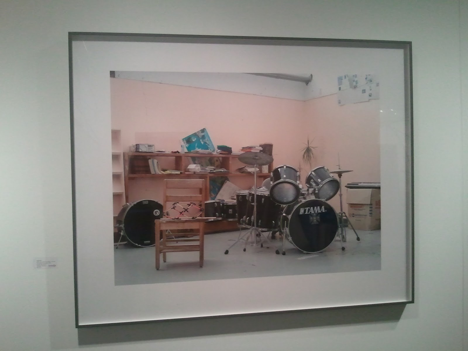
“Michellle, Rome,” 2011 by Alec Soth


The colours in this photo are all allied yet it is the clear difference in value between the ceiling and the rest of the photograph that makes it striking, it being a much more saturated pink. The photo of the blond woman follows second in saturation and finds itself roughly head height in relation to the spout of the tap, which is situated around the pelvis. This set up made me view the photo head to toe.


“Ice Fiord leading to Jakoabshvn Glacier #1” 2008 by Terry Evans


This photo by Evans consists of a mixture of warm and cool colours. The Glacier, predominantly shades of white is surrounded by a pool of water of varying tones of green, the relationship of these two make the water a focus. The ground in contrast is much warmer with a yellow tinge.


This series of paintings by Paul Cowan, were a piece, which attracted me from a distance. There bright, near fluorescent yellow was unavoidable to the eye. From a distance I thought the bright purple marks were indeed black, it was only when I got closer that I realized that in fact they just appeared black as the contrast was so strong between the complementary pair that they had been completely overwhelmed by the dominant yellow. The red strokes however really stood out, as their saturation was relatively much stronger than the yellow backdrops.
”The Archive Revisited: Pigs” by Philippe van Shik


This piece was a photo of pigs over-laid with a grey and a black rectangle of a similar hue to the photo itself. The grey is sandwiched between a blue and orange rectangle. The orange being brighter and more intense than the blue, a contrasting complementary, draws the eye first and then it moves onto the blue guiding the eye. The positioning of the grey rectangle means that the eye produces a modulation of greys ranging from those of blue to orange tones along its length.


“Golden Escalator, Tokyo” by Michael Eastman

This piece is an example of a piece with strong temperature difference. The ceiling/ upper part of the photo is warm with colours of deep orange to yellow. Whilst the escalators are far cooler with tones of blue and violet. This contrast gives us the feeling of ascension I believe the artist desired.


“Yellow, Yellow” by Rachel Whiteread

Whitread’s sculpture here is an example of carefully chosen allied colours. The casts of the inside of cups, boxed and cardboard tubes are all of a similar value and intensity. The yellow cup on the left is an exception, along with its different, stockier, shape it acts as a sort of initial draw and a point to relate the other shapes to.

“Resisted Array”  Liam Gillick

Within Gillick’s piece we have examples of allied colours paired with a complementary colour, which adds a punch, giving the works more depth.

”Life Magazine, April 19th, 1989” by Alfredo Jaar

This piece by Jaar consists of a standard photo of a busy street at a normal value. In the other two duplications the colour of the original photo is a lot lighter but are then overlaid with much more intense black dots first, these are in place of the faces of all those in the crowd. In the second duplication only a couple of faces are marred in red dots. The cultural associations with red indicate that these figures labeled as red must be of higher importance within the context of this work.


“Coded Spectrum 2011” by Leo Villareal

This work is basically a glorification of colour theory. The light boxes colours shift through the spectrum, varying saturation, intensity, value and temperature demonstrating the beauty in varying harmonies. The fact light boxes are used gives the colour a greater intensity and therefore appeal.

from Expo, hyun.

1. The colors take place in the center of the frame and everything else is black. I see some stars and plants behind her (technically in front of her?) but because of the warm color in the dress she's wearing, my eye goes to the figure at first and then start to move to the plants and then the stars. From far away, the photo seems like black and white plus one color which is pinkish-purple. And the photo feels warm in general.


2. Even though there are many different colors in the picture, there are three main tones that are red, blue, green (+black and white). Colors seem desaturated for the mood the photo creates. The blue one in the background makes a great contrast with the wall color and it makes the whole photo not boring. Wall seems to be expanding but the blue image gives another space inside of the wall or through the wall or it gives a sense of a space behind the wall. Also, the repetition of the use of pinkish color in the background, middle ground (furnitures) and the foreground the thing on the chair makes the photo more united.


3. just the right amount of color for a good photo! i think. I like how different tones of brown/yellow ochre are used in the photo in different subjects. Analogous colors makes great united feeling even though the objects in the frame are not neatly aligned. I also like the detail of a figure and the fact that she's cropped out. 


4. the red color draws attention so well because it's one of the primary colors and there are similar tones of primary color in that spot. yellow field, blue line, red line. they are all together and they are surrounded by black trees. the photo itself seems to have a limited color palette but actually it's using many colors in the color wheel. it gives a feeling of unity also because of the yellow background. even though the yellow is a warm color of course, the yellow is desaturated and mixed with and green so it doesn't have the feeling of expanding and i think that's what makes the photo not overwhelming. 


5. black and white photo from NASA. nothing too much to talk about in terms of color in this picture but the light makes the subject pop up showing a lighter gray and almost white highlight which means it has various values. this picture is monochromatic and achromatic. 


6. this lighting piece is including many shades of purple in general, and of the colors of the lights. very expressive in terms of color, the artist seems to know what exact color he/she wanted. the artist is hiding the yellow, warm colored, light toward the walls and showing the blue light toward to the viewers which is opposite characteristics of the colors. all the colors showing in this photo seems like it's almost primary colors with the purple instead of red so it draws attention to the space. 


 7. only one color is used in this sculpture piece, rose gold or pinkish color for the object. it's a little desaturated. it's not vivid at all but the tension between the sculpture and the white box makes a great harmony in terms of color. even though there are only two colors involved in the piece and the box, in this picture, it goes well with the color of the floor too which makes me think this is kind of analogous. it's minimal and subtle.


8. this booth had many of these monochrome paintings in different sizes. they were yellow, pink (in the picture above), and same color but in larger size, and red and so on. in this picture, pink and yellow which almost looks like neon yellow makes me feel complimentary color of the paintings being next to each other. each painting has many values and the colors are saturated. In spite of the fact each has one saturated color with many values of one hue, the center is the focal point where the color gathers or starts to spread from, it is calm. 


9. I see it's black and white + red, green, blue (additive color which is a base of lights). Also, I see complementary color, red and green, and black and white. the white part on the top stands out a lot even though there's a complementary color in another white box because the white box on the top is very expressive with nothing in it. and then i see the white box in the middle because it's in the almost center of the frame, and it has colors in it. the dark background makes the viewer focus on the white boxes and the thing i see at last is the white left bottom corner. the value of white boxes changes as it gets darker from top to bottom. 


10. many various colors are used in this installation / photo / sculpture work. in each picture, most of them are monochromatic with many values of the dominant color. since it was a cut out of the lights in each pieces, it gives the gradient of the specific color, hue. there are two photos that used complementary color and other than those, it can also be said that they are black and white plue one color. 

Thursday, September 27, 2012


-->
1)   Kehinde Wiley
Shantavie Beale II

Color in this painting is an extremely dominant element of the piece. The colors are extremely saturated. The skin color of the figure is quite warm, and even though the background is mostly green, it feels warm as well. The light green of the leaves contrasts with the dark blue of the background and therefore moves forwards. You could say the colors in the painting are expressive because of how unrealistic they are.   


2)   John Baldessari
Pointing Hand, Desk, lights, and observers (Courtroom)

In this piece, Baldessari uses color to highlight certain things to the viewer. The bottom part of the piece is in black and white, yet certain things such as the lights, the hands and dots on faces are in color. In the top part he uses the shape to highlight certain parts of the photo. The orange and yellow are clearly the focal points at the bottom part as they are the only colors and therefore stand out. You could say this is black and white and 2 colors color harmony. 


3)   Cindy Sherman
Untitled

The colors in this photo are unsaturated and seem like they haven’t been manipulated in any way therefore they are realistic. The top background is light yellow, which contrasts well with the bottom dark purple, which are complementary colors. The background yellow is quite similar to the skin tone of the doll, which creates a flat surface. There are many different textures in the photo, the fabrics and the plastic doll textures contrast each other. I wish the background of the doll was darker so the doll would stand out more.

4)   Lorna Simpson
Jet #8

Color in this collage adds a significant meaning to the piece. I think colors here are culturally symbolic as they signify subjects about race. The images are black and white and Simpson added their hair with acrylic color, therefore making the color in each collage a focal point (black and white with one color). Using unnatural colors for their hair creates a whole different meaning to the hair and the people. The colors in this piece are obviously cool.


5)   Bill Viola
Dissolution

The colors in this piece are monochromatic; they are all in the shades of blue. There are no defined lines as the figures in the images are underwater. The water makes their skin tone and other features blue, which could be interpreted as expressive color presentation.

6)   Catherine Opie
Crenshaw High School Marching Band

The color of the green grass is the most dominant in this photograph and contrasts with the blackness of the sky, creating a sharp line at the vertical center. The blue and the green are saturated and stand out/ moves forward in the photo.  The white clothes and socks do not move forward as much because of the green, if the background was darker they would move forward. Since the blue and green are quite close in the color you can say the color combination here is analogous.

7)   Angelica Dass

This piece is another example of how the colors give the piece its meaning. The background colors here are a clear reference to the skin colors of the figures therefore the use of colors here is cultural. I think this piece would be considered as monochromatic, because there are mostly different shares of pink and brown. By having the same color of background as the subjects skin color, the figures don’t stand out as much as they would have if they were in front of a brighter/darker color, therefore they blend in with it, which I think again further demonstrates the significant meaning of the colors in the piece.

8)   Nan Golding

The colors in this image are obviously warm and expressive, as they set an atmosphere to the photo. Because of the warm lighting, the skin color of the figures look almost red. I think the warm colors strongly relate to the content of the photo that seems like an intimate moment Golding managed to capture.

9)   Gwynne Johnson
Revisions

In this series of photos, the artist captured the back of the heads of older men with the sky as the background. The color of the sky varies of each photo, but they all seem to be in the shades of light blue. In three of the four photos the color of their clothes seem to be darker than the background, which contrasts with the light blue color of the sky. the color of the figures hair seems to be light as well which blends therefore doesn’t stand out very much compared to the color of the sky. 

10)  Jani Leinonen
Enslaved and Free

The colors in this work clearly reference consumer products therefore making them culturally symbolic. The colors are saturated and vibrant, relating to the content of the piece, which is cereals boxes, and their need to be eye-catching for the consumer to buy them. This is another example how color is used to portray a specific meaning to the viewer.  

Sterlin Ruby


Sterlin ruby

First off, I wish that he had had a little more time to speak. He seemed to trail off into little side thoughts and tangents that were at most times difficult to follow. I also wish that he had been able to show and explain a few pieces of his work prior to beginning his interview so that we as the listeners had some sort of reference point as to where he was going and what he was referring to and talking about-what kind of artist he was or what type of medium he predominantly worked in. Because he didn’t do this I had to conjure something else in my own head of what he was talking about. It would have been very helpful for me because as everything he was saying was fairly interesting to me I still felt like I was very much in the dark at times and coming into a story half way through with no background story. Either that, or I had hoped he’d been guided and directed by his interviewer a little more to keep him on topic, corral him and make him aware of timing and staying on some semi-cohesive track. It felt disjointed and random. Perhaps that is some of his charm. I really enjoyed hearing about his childhood and how he grew up in a foreign country for much of his early years and then immigrating to the states where his father was from. The fact that his family always seemed to live with a large number of people I thought to be important. It didn’t seem to me that his immediate family fostered art with him as a child, but I wonder if any of the people that they lived with or any of their house-guests had some sort of influence in that realm of art with him. If there was anyone in particular that really got him thinking about art of appreciating it. His path was intriguing. Construction, music, skateboarding and then feeling like he needed to figure out what to do with his life. His very traditional artistic schooling once he decided to ‘do something with his life’ and after a friend of the family got him into the school was inspiring in that he started doing something with himself a little late in the game after working manual labor jobs and being a musician but still succeeded into what he is today. It seemed to me that he adapted to school life fairly well and that he gained a lot of knowledge while he was at the very traditional art school learning all the basics in many disciplines. His school transitions were not what I was expecting. He became seemingly and intensely philosophical. His schooling path got really intense. When he finally started talking about sculptural pieces that he had been working on it was really nice to have a visual to his work but I didn’t necessarily grasp his intent with it. The bus piece and the prison cells didn’t make sense to me, or perhaps I just didn’t identify with it. I can’t really put my finger on it. It was definitely impressive but it just didn’t resonate. Nothing that he spoke of leading up to that last bit correlated. All in all it wasn’t my favorite interview on the planet, but I appreciated it nonetheless.
Kalee Peters