
1. The colors take place in the center of the frame and everything else is black. I see some stars and plants behind her (technically in front of her?) but because of the warm color in the dress she's wearing, my eye goes to the figure at first and then start to move to the plants and then the stars. From far away, the photo seems like black and white plus one color which is pinkish-purple. And the photo feels warm in general.
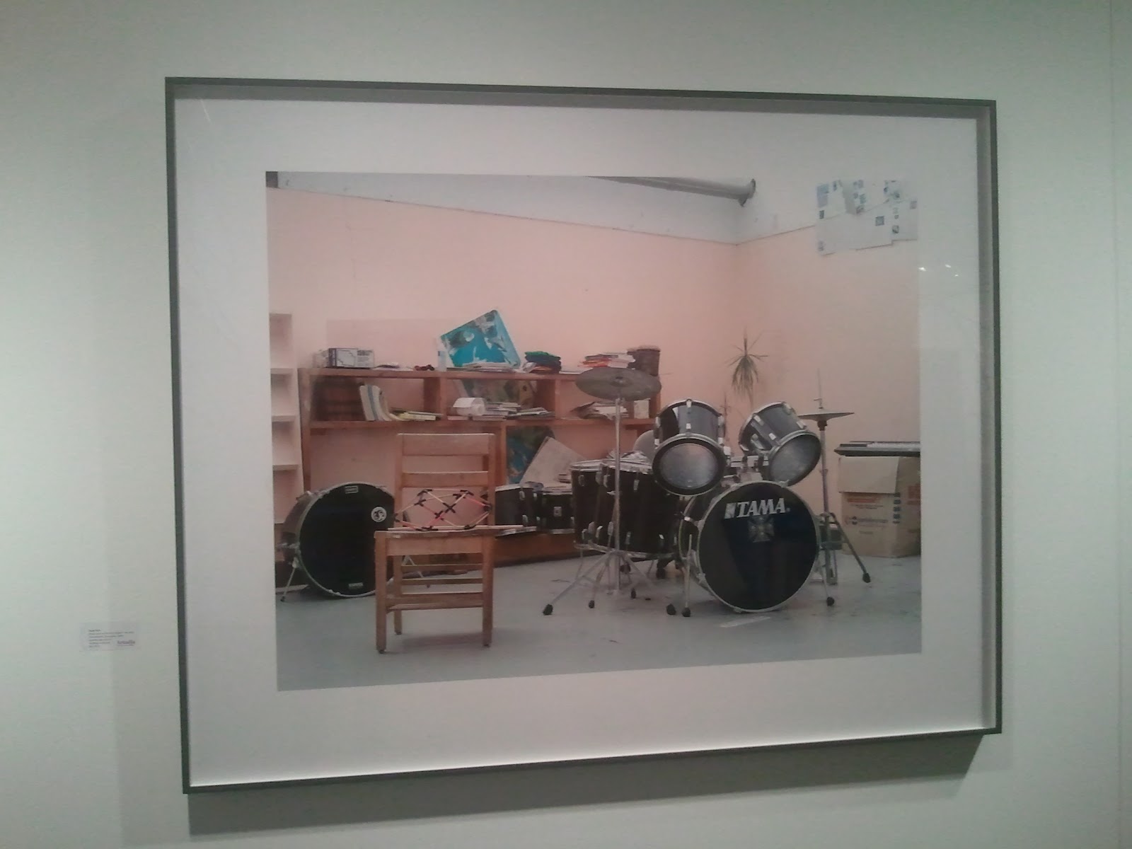
2. Even though there are many different colors in the picture, there are three main tones that are red, blue, green (+black and white). Colors seem desaturated for the mood the photo creates. The blue one in the background makes a great contrast with the wall color and it makes the whole photo not boring. Wall seems to be expanding but the blue image gives another space inside of the wall or through the wall or it gives a sense of a space behind the wall. Also, the repetition of the use of pinkish color in the background, middle ground (furnitures) and the foreground the thing on the chair makes the photo more united.

3. just the right amount of color for a good photo! i think. I like how different tones of brown/yellow ochre are used in the photo in different subjects. Analogous colors makes great united feeling even though the objects in the frame are not neatly aligned. I also like the detail of a figure and the fact that she's cropped out.

4. the red color draws attention so well because it's one of the primary colors and there are similar tones of primary color in that spot. yellow field, blue line, red line. they are all together and they are surrounded by black trees. the photo itself seems to have a limited color palette but actually it's using many colors in the color wheel. it gives a feeling of unity also because of the yellow background. even though the yellow is a warm color of course, the yellow is desaturated and mixed with and green so it doesn't have the feeling of expanding and i think that's what makes the photo not overwhelming.

5. black and white photo from NASA. nothing too much to talk about in terms of color in this picture but the light makes the subject pop up showing a lighter gray and almost white highlight which means it has various values. this picture is monochromatic and achromatic.

6. this lighting piece is including many shades of purple in general, and of the colors of the lights. very expressive in terms of color, the artist seems to know what exact color he/she wanted. the artist is hiding the yellow, warm colored, light toward the walls and showing the blue light toward to the viewers which is opposite characteristics of the colors. all the colors showing in this photo seems like it's almost primary colors with the purple instead of red so it draws attention to the space.

7. only one color is used in this sculpture piece, rose gold or pinkish color for the object. it's a little desaturated. it's not vivid at all but the tension between the sculpture and the white box makes a great harmony in terms of color. even though there are only two colors involved in the piece and the box, in this picture, it goes well with the color of the floor too which makes me think this is kind of analogous. it's minimal and subtle.

8. this booth had many of these monochrome paintings in different sizes. they were yellow, pink (in the picture above), and same color but in larger size, and red and so on. in this picture, pink and yellow which almost looks like neon yellow makes me feel complimentary color of the paintings being next to each other. each painting has many values and the colors are saturated. In spite of the fact each has one saturated color with many values of one hue, the center is the focal point where the color gathers or starts to spread from, it is calm.

9. I see it's black and white + red, green, blue (additive color which is a base of lights). Also, I see complementary color, red and green, and black and white. the white part on the top stands out a lot even though there's a complementary color in another white box because the white box on the top is very expressive with nothing in it. and then i see the white box in the middle because it's in the almost center of the frame, and it has colors in it. the dark background makes the viewer focus on the white boxes and the thing i see at last is the white left bottom corner. the value of white boxes changes as it gets darker from top to bottom.

10. many various colors are used in this installation / photo / sculpture work. in each picture, most of them are monochromatic with many values of the dominant color. since it was a cut out of the lights in each pieces, it gives the gradient of the specific color, hue. there are two photos that used complementary color and other than those, it can also be said that they are black and white plue one color.
No comments:
Post a Comment